Back in stock alerts for any website, including the stores that won't waitlist you
The store's "notify me" email is a marketing flow with a throttle, and some pages have no button at all. How to build a restock alert that reads the product page itself, on any store.
The thing came back on a Tuesday. You found out on Thursday, from a friend, and by then it was gone again. Somewhere in your inbox there is an email from the store that arrived Wednesday night, sitting under a promo for something else.
You did the responsible thing. You clicked "notify me when back in stock" three weeks ago and entered your email. That button was never an alarm.
Here's what it actually is, and what to do on the pages that don't even offer it.
The "notify me" button is a marketing flow with a throttle
On a large share of Shopify stores, that button hands your address to Klaviyo. What happens next is a flow. Subscribers park at a Back in Stock Delay until inventory returns, and then three settings decide whether you hear about it:
- A minimum inventory threshold: small restocks can be configured not to send at all. Two units back on the shelf, nobody gets mailed.
- Customers to notify per restocked unit: the flow mails the oldest N subscribers for every unit that came back.
- A wait time between notifications: after that first batch, the flow pauses before sending the next one, and keeps going until stock drops back under the threshold.
Klaviyo's own setup guidance walks merchants through tuning exactly these numbers, which tells you who the feature is for.
Worked example. Twenty units come back. "Customers to notify" is set to 5 per unit, so the oldest 100 subscribers get an email. You signed up in week three and you're number 340. Your email is behind a batch counter, a wait timer, and a threshold you can't see, and the twenty units are gone in eleven minutes.
You're not in a queue. You're in a segment.
Native waitlists misfire too. There's a Bambu Lab forum thread where a customer reports getting back-in-stock emails roughly twice a day for a filament SKU that's out of stock every single time they click through. That's the other failure mode: an alert you learn to ignore.
And plenty of pages have no button at all
The waitlist button exists where an app is installed. One Shopify back-in-stock app advertises delivery across 25,000+ brands, which is a lot of stores and also a very specific shape of store.
Places the button isn't:
- Marketplace third-party listings: the seller who actually has it in stock isn't the one running the notification flow.
- Discontinued or end-of-life SKUs: the store stops waitlisting a thing it doesn't plan to reorder, even when a returned unit shows up.
- Size and colour restocks: the product page reads "in stock" because a 42 exists. You wear a 38.
- In-store pickup availability: online stock and "available at your store today" are different numbers on the same page.
- Everything that isn't retail: resale listings, auction lots, ticket releases, a rental that comes back on the calendar.
For all of these, the page knows. It just isn't going to email you.
What "in stock" actually looks like inside the page
Availability is usually machine-readable before it's human-readable. schema.org defines ItemAvailability as a fixed set of values: InStock, OutOfStock, BackOrder, PreOrder, PreSale, SoldOut, LimitedAvailability, InStoreOnly, OnlineOnly, Discontinued, MadeToOrder, Reserved.
Read that list again, because it's the whole false-positive problem in one place. PreOrder is not InStock. BackOrder is not InStock. Both of them turn a grey "sold out" label into a bright, clickable button, and a monitor that watches the button will tell you the item is back when what actually happened is that you can now pay for a thing that ships in March.
Shopify goes finer. Each variant object carries available: true|false next to its title, price and SKU, so size-level truth exists in the page's own data even when the visible UI hides it behind a dropdown you have to open.
The catch is where that data lives at fetch time. UptimeRobot's keyword tutorial tells you to alert when the string "out of stock" stops existing, and then concedes, in one sentence, that the string may be written by JavaScript after load and therefore never appears in the raw source at all. That caveat is the entire ball game on a modern storefront.
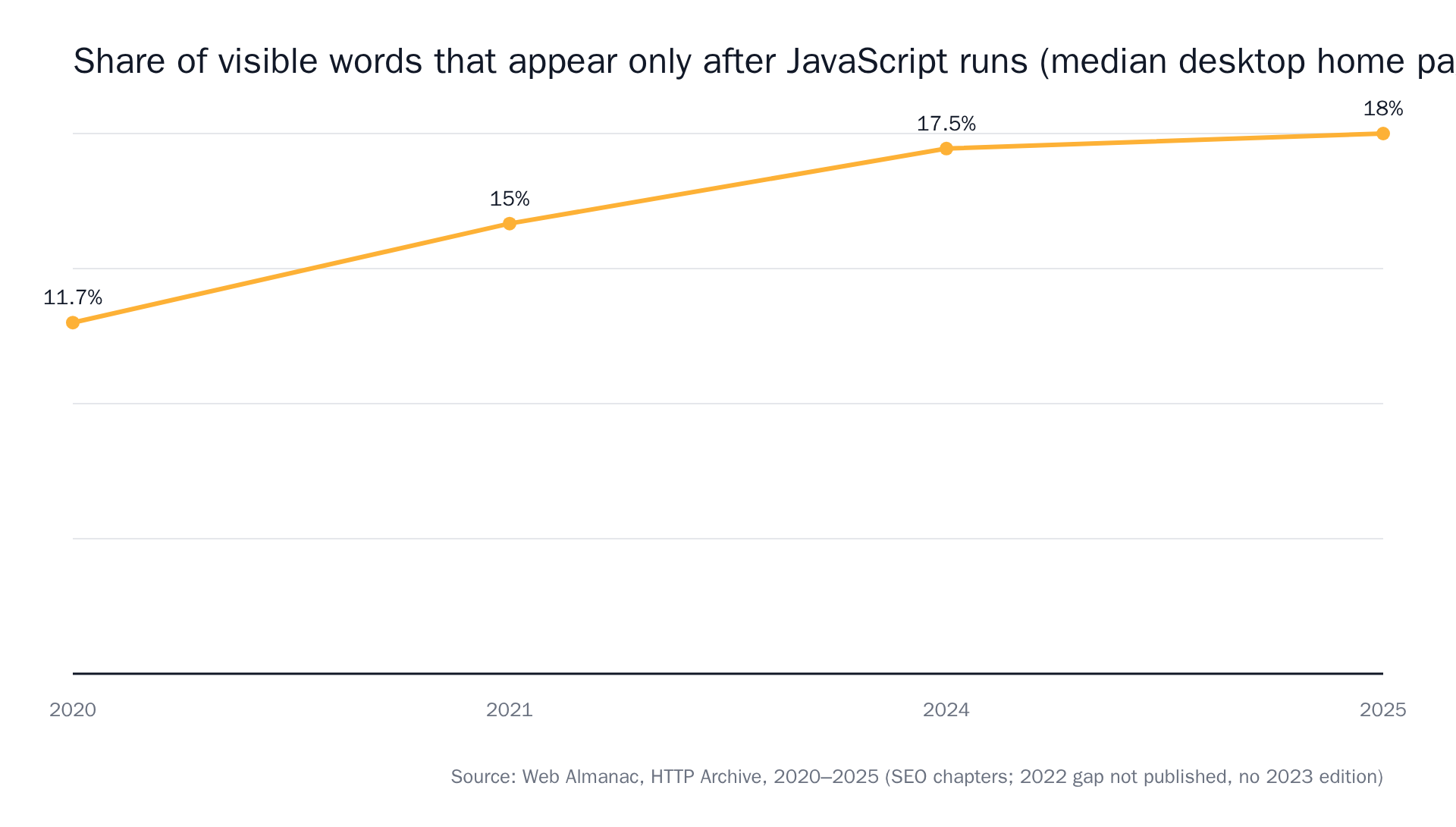 Source: The Web Almanac by HTTP Archive, 2020 and 2025.
So: the page tells the truth, but not always in the HTML a plain fetch gets back. We wrote a longer piece on monitoring pages that don't exist until JavaScript runs them if you want the diagnostic steps.
Write the prompt for the outcome, not the page region
This is the fork in the road. Most restock monitors detect that something on the page moved and then try to work out whether it mattered. You want the opposite order: state what matters, and only get told when that happened.
A bad prompt:
Alert me when this page changes.
That fires on the recommendation rail, the review count, the "12 people are viewing this" widget and the currency toggle.
A good prompt:
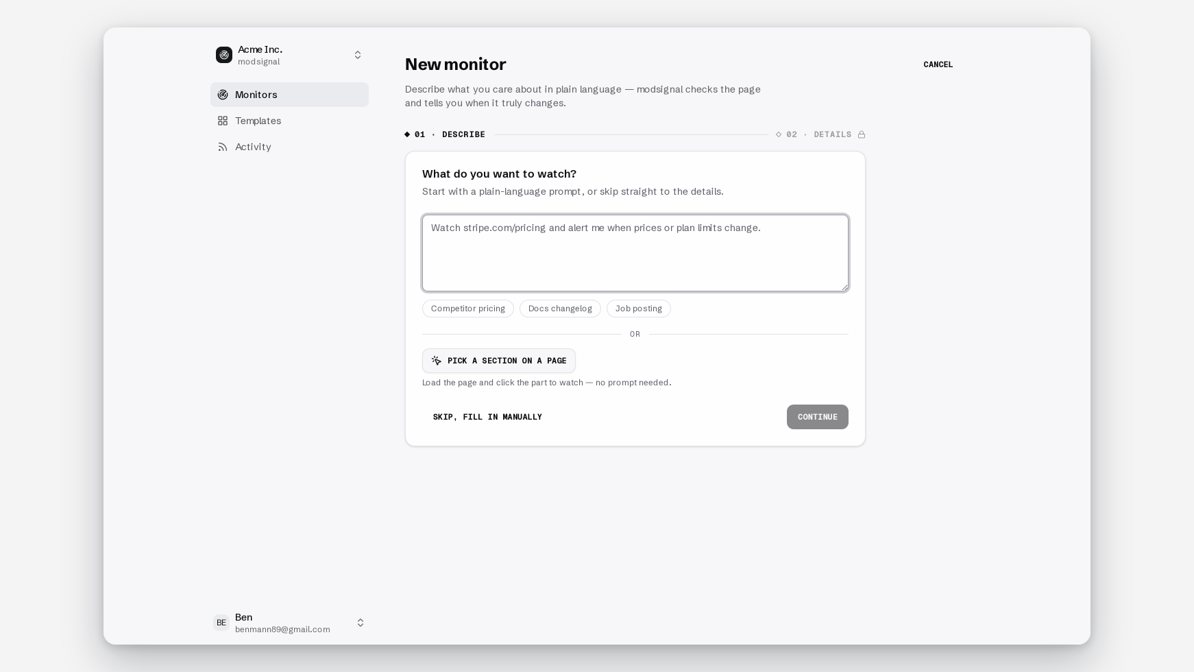
Alert me when size 10 in black becomes available to add to cart — not pre-order, not back-order, not a "notify me" form. Ignore price changes, reviews and recommended products.
That sentence is a judgment a model can make against the page. It is not something you can express as a CSS selector, which is why selector-based tools hand you the workaround instead: one alert per element, then filter the results yourself.
On the semantic tier, one model check per run reads the fresh page against the last snapshot plus your prompt, and answers one question: did the described change happen? You get a summary sentence, before/after excerpts, and a confidence score.
If you want the general rules for phrasing, our guide on writing a prompt that knows the difference between "the page changed" and "the thing I care about changed" covers the patterns that hold up.
One monitor per variant, not one per product
A monitor is one URL, one prompt, one tier. It's tempting to write a single prompt covering sizes 8 through 11. Don't.
Four sizes in one prompt gets you four times the alerts and no clean answer about which one fired. Four monitors, four sentences, four separate notifications with the size in them. On the free plan that's three monitors, so pick the three sizes you'd actually buy.
Pick the tier the page deserves
Three tiers, chosen per monitor. It's a dropdown, not a migration, so change your mind after the first bad alert.
Exact diff. Byte-for-byte text comparison against the last snapshot. No AI call. Evidence is a unified diff, the same before/after format you'd see in a code review. This is the right answer for a quiet page or a JSON endpoint where availability is the only thing that ever moves, and it's the cheap option that's often correct. Its failure mode is the busy product page: point it at a storefront with a rotating carousel and it will report every rotation, correctly and uselessly.
Semantic. One model check per run, reading the page against your prompt. This is the default for real product pages, where badges, review counts and "customers also bought" rails churn constantly and one line in the middle is the one you care about. Its failure mode is a page whose stock state never reaches the fetch, because the model can only judge what it was handed.
Browser agent. Launches real Chromium, waits for the page to settle, dismisses the cookie banner, opens the size dropdown, scrolls, then applies the same semantic judgment. Adds a full-page "page as checked" screenshot. This is the tier for client-side-rendered stores and for anything where the variant only resolves after a click. It's the most expensive tier per check, which is why it's a choice rather than the default.
The longer breakdown of the three tiers has the browser test you can run in thirty seconds to tell which one a page needs.
Set an interval you'll actually act on
We price by reach, not per alert. Checks are never metered, so the interval is a plan feature rather than a budget you burn:
- Free: $0, 3 monitors, daily checks, exact diff and semantic, no browser agent, no card.
- Pro: $25/mo, 25 monitors, checks every 15 minutes.
- Scale: $49/mo, 100 monitors, every 5 minutes.
- Business: $99/mo, 500 monitors, every 2 minutes.
Now the honest part. Higher is not better. A 200-unit drop that clears in 40 seconds is not a monitoring problem, it's a lottery, and a 2-minute check won't win it. What a 2-minute check does win is the restock that sits there for an hour because nobody was watching. And a daily check is the right setting for the pair of boots you'd be happy to catch sometime this week.
Pick the interval that matches how fast you'd actually get to your phone.
Where this struggles
Four places this doesn't work:
- Login-walled pages: if stock only shows after you sign in, we can't see it.
- Stores that hard-block automated requests: some do. You'll find out fast, and the answer is usually a different URL on the same store.
- Sub-minute drops: see above. Nothing on a schedule beats a bot on a queue.
- Cart-dependent or regional stock: "available" can mean available in a warehouse that won't ship to you. Prompt for your region if the page shows it, and check the first alert manually before you trust the rest.
Where a store publishes a clean JSON endpoint for the product, monitor that at exact-diff tier. It's the quietest, cheapest, most literal option available, and on an endpoint every change really is signal.
The alert should be enough to buy from
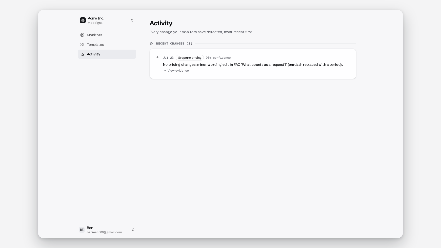
Every alert carries the same shape: one sentence saying what changed, the before/after excerpt (or the unified diff), a confidence score, a full-page screenshot on the agent tier, and a link to the monitor timeline, which holds the full history and is the source of truth.
The bar we hold ourselves to is that you tap the link and check out. You don't reopen the page at 6am trying to work out what the red box was pointing at.
How the other tools handle this
Numbers below verified against public pricing pages in August 2026. Check their sites for current figures.
UptimeRobot offers a free back-in-stock tool advertising up to 50 pages at 5-minute checks with no credit card, built on keyword monitoring: alert when "out of stock" stops existing. On a server-rendered page with a stable string, that is a genuinely good deal and you should just use it. Choose it if you view the page source, find the literal words in the raw HTML, and only care about whole-product availability.
Visualping is the biggest name here and reports over 100,000 shoppers running retail monitors as of April 2026, which is real evidence the workflow works. Choose it if you want visual diffs and a browser extension, and you're fine with daily checks on free. Its detection is change-first, with AI classifying importance afterwards, which we've written up on our Visualping alternative page. Distill.io rewards people who enjoy configuring things and has years of maturity behind it, and if you self-host, changedetection.io is the correct answer for a lot of people.
The pattern across all of them is that they alert on change and then ask what it meant. We ask first.
The short version
The waitlist is an email flow with a throttle, and half the pages worth watching never offer one. Reading the page yourself takes one sentence: name the variant, name the outcome, rule out pre-order.
The back-in-stock template ships with a page, a prompt and a sample alert, so you can see the shape before you write your own. The free plan gives you three monitors on daily checks with no card, which is enough to find out whether the thing you want comes back on Tuesdays.